The basic picture is straightforward: inequality rose markedly under Thatch. From 1979 to 1995/6, the proportion of people below half average income more or less doubled.
Of course, partly that is because average incomes rose markedly (by about 40% adjusted for inflation). But the appendices have information on the percentages of groups below various fractions of 1979 average income, held constant. In 1979, 8% of people were living below half 1979 average income. In 1995/6, 5% of people were living below half 1979 average income (adjusted for inflation). The figures for 60% of 1979 average income are similar: 18% and 10% respectively.
However, the AHC figures are much less cheerful, with the proportions of individuals living below these thresholds remaining almost constant. And the very poor do badly. There were about as many people below 40% of 1979 average income in 1995/6 as there were in 1979, whether Before or After Housing Costs.
End of brief statistical lecture. Everything is much more complex than this - for example, what about the experience of different groups? Families with children? Pensioners? What about the persistence of inequality over time? What's the right way to define or even conceptualise poverty? Despite being a Sinister Rightwinger, I believe that relative poverty is very important. Being poor, and specifically being poorer than other people, is horrible. Of course absolute poverty is bad too. Oddly enough these ideas tend to be backed up by the (stereotypically, right-wing) Darwinian approach to society: beyond satisfaction of our basic needs, we care about our relative position rather than our absolute wealth.
Corrections from the people at ISER (who do this kind of thing seriously) are of course welcome. Perhaps I should now stop reading DSS statistics on Friday night.
Just one further thought. The distribution of "talent" of many kinds is probably normal, like most things that rely on many different factors (if you add a lot of random variables together, you approach a normal distribution - the famous bell curve). The distribution of income is not normal. It looks much more like a lognormal distribution, such as the lefthand picture below
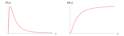
- pictures filched from http://mathworld.wolfram.com/LogNormalDistribution.html
Why? I am sure there are many extant answers to this question. My guess, keeping with the Darwinian theme, is that overachievers tend both to hang out with each other, and to compete with each other for income (or various correlates of income). This makes for a "long tail" distribution, with the mobile phone salespersons, the city slickers, and Bill Gates at the very, very top.
No comments:
Post a Comment